…yet another
planning & to-do app?
As a designer, I've always wanted to design and build my own *simple* notes app. Now I finally did. Here's the droplist story.

the over-complicated competition
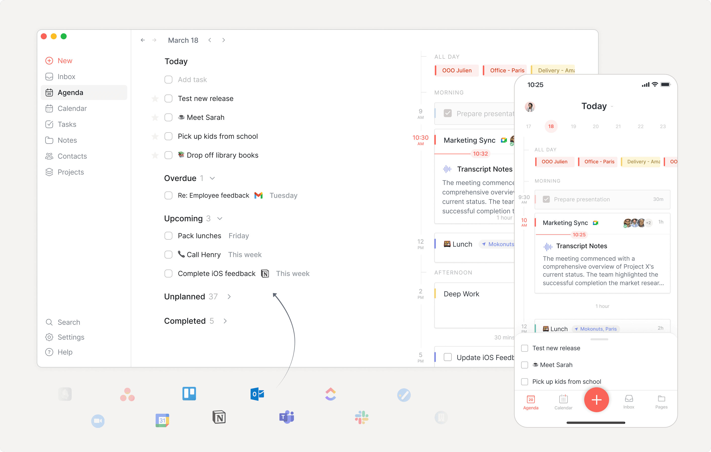
In an age of everything to-do apps and AI planners, I wanted something simple and stripped down to the essentials
After trying loads of over-built and feature-rich tools, I kept finding myself back to pen and paper.
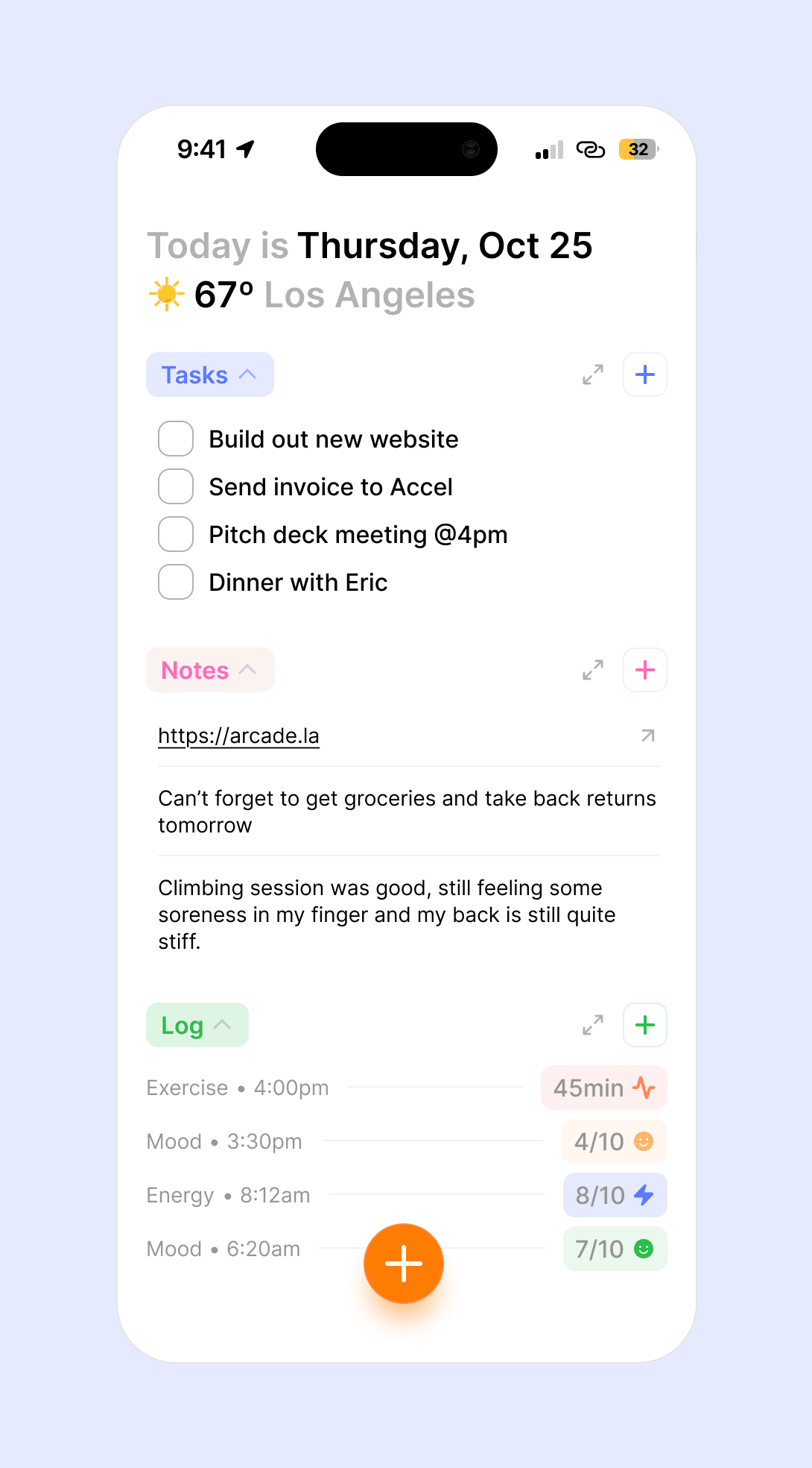
If you know me, you will never find me without notecards or a tiny notebook in-hand. I'm constantly writing down ideas, doodling, and making task lists with things to do on an assortment of sticky notes, index cards, and pocket notebooks.
I love the flexible nature of keeping small, pen and paper notes, but this also comes with a draw back. I often find myself losing essential ideas and notes I know I jotted down somewhere, but are lost in a sea of papers, drawers, and rooms.
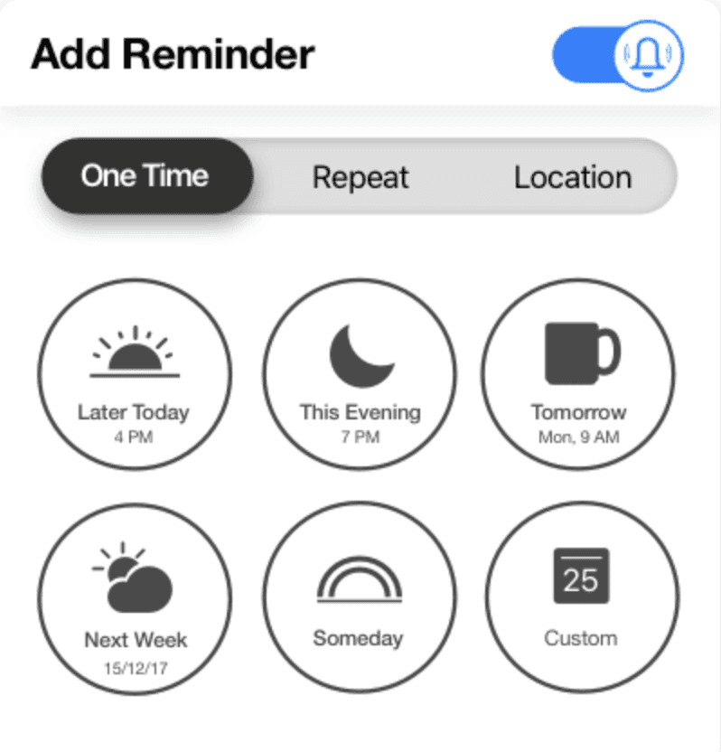
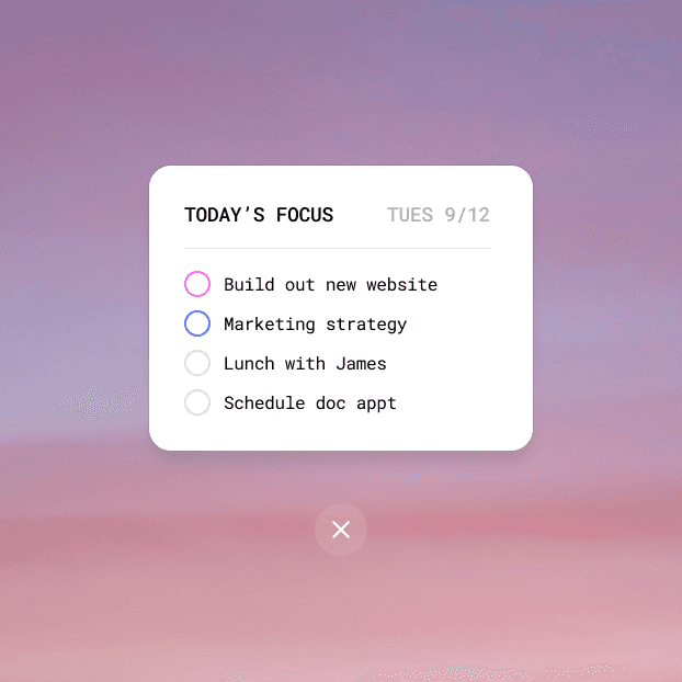
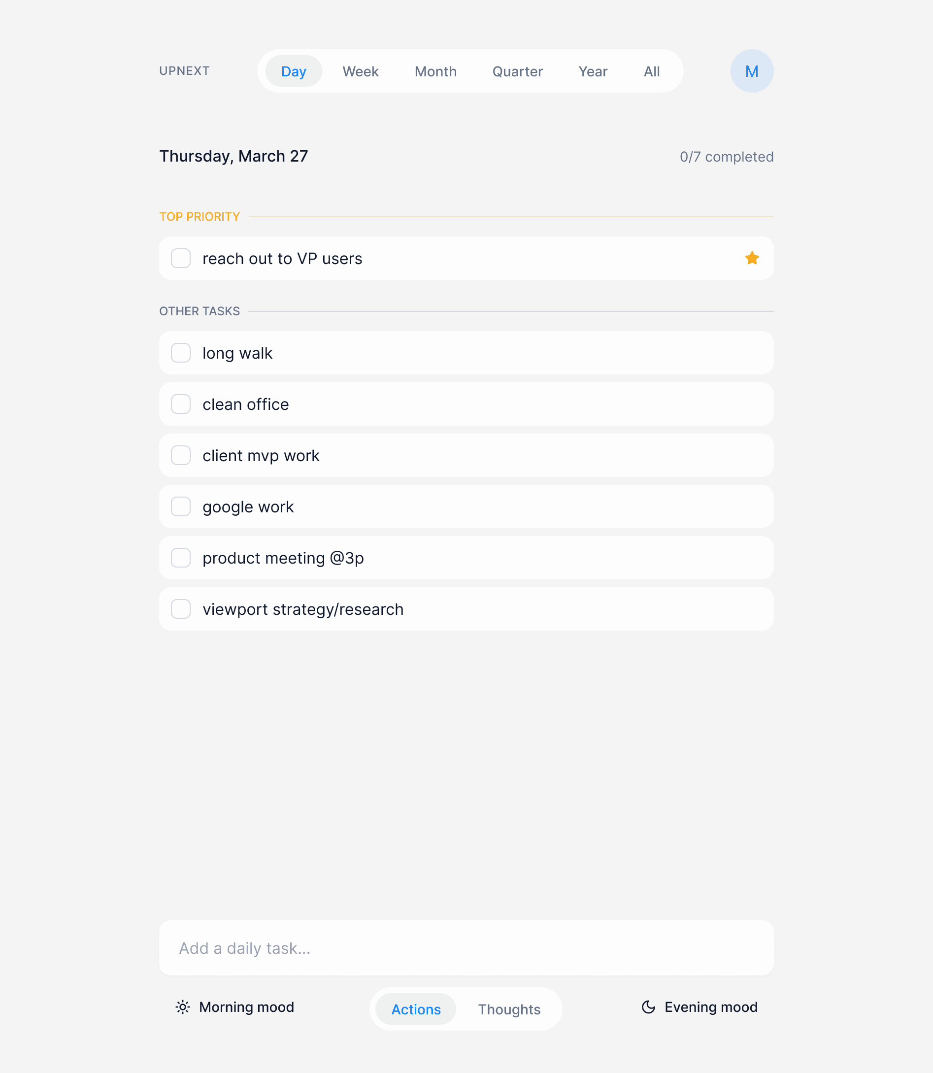
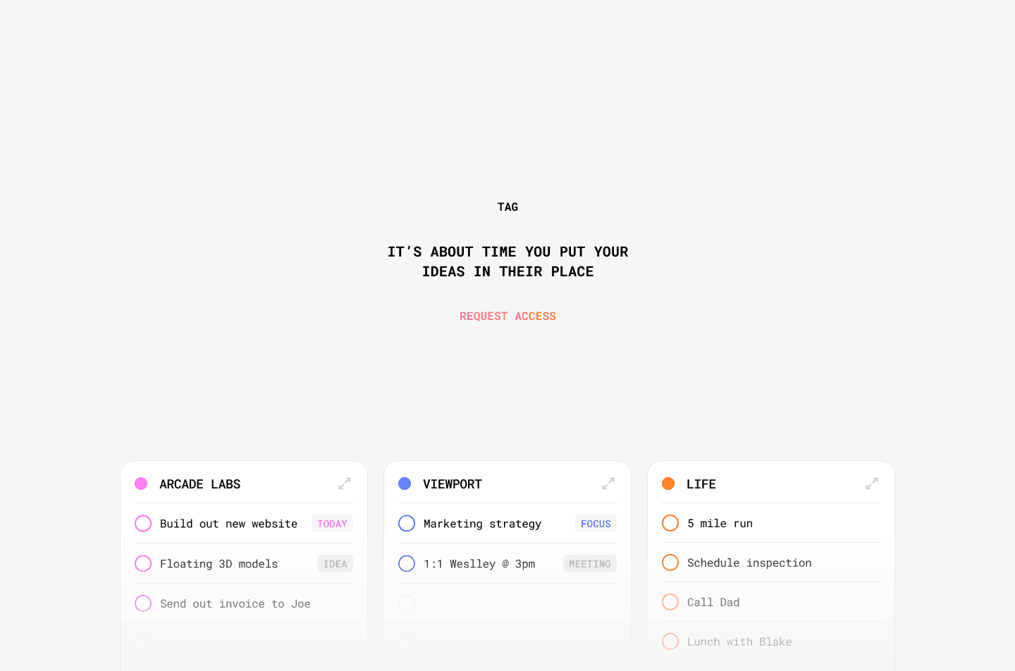
I tried a lot of different approaches trying to recreate a digital space that felt like a pen and paper
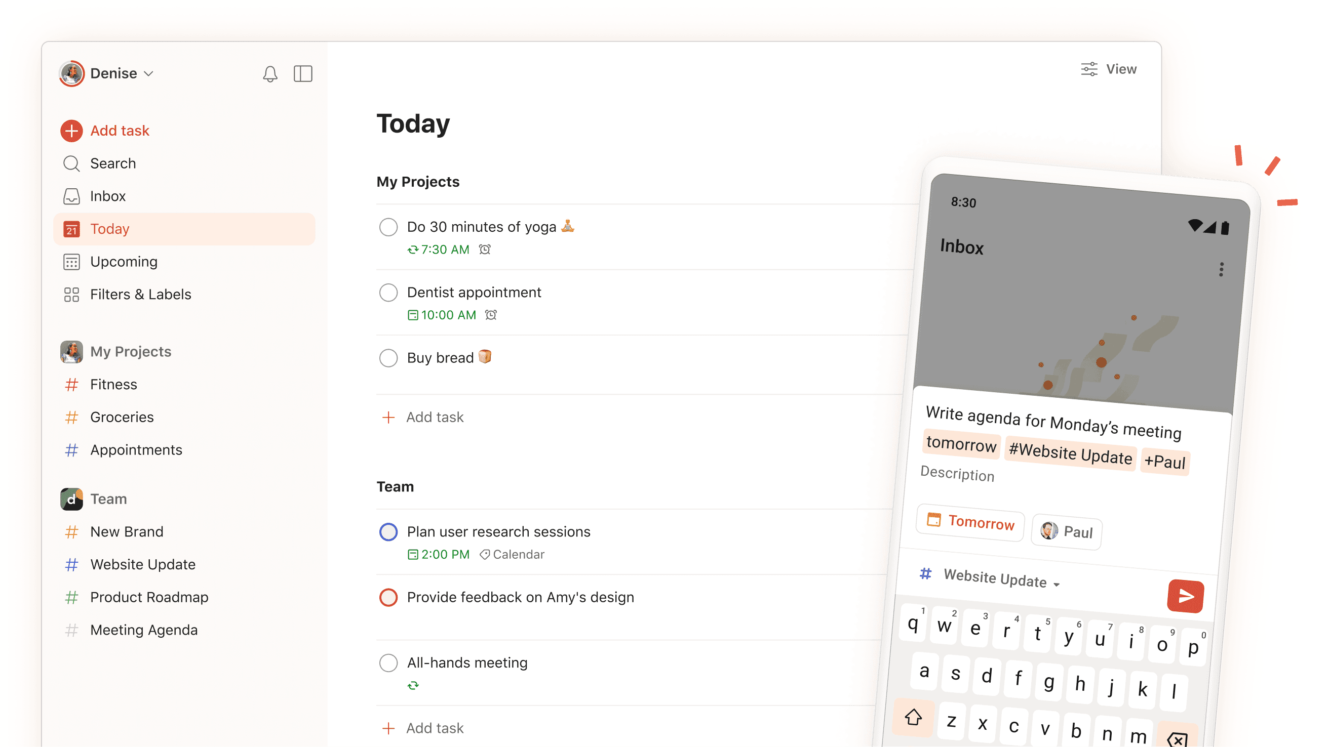
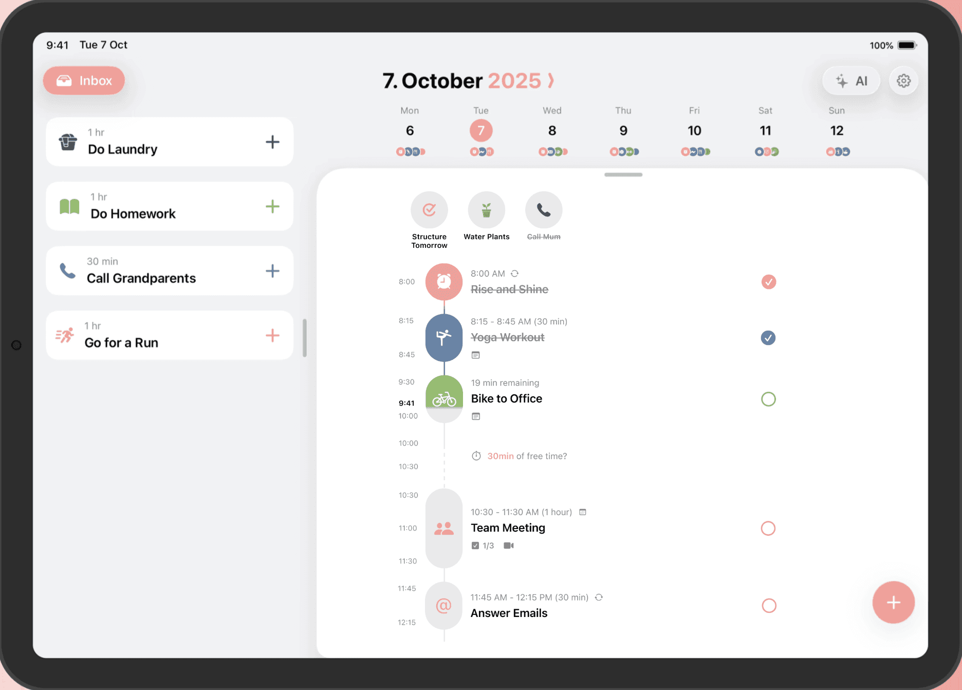
I built 3-4 fully working prototypes that I used and tested daily for 3+ months, trying to get the right balance of ease of use, simplicity, and creating something that actually *felt* right.
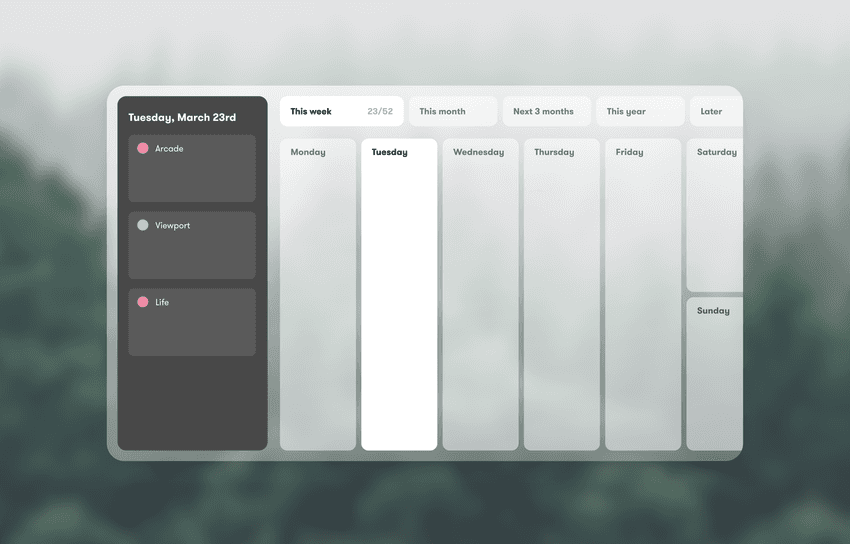
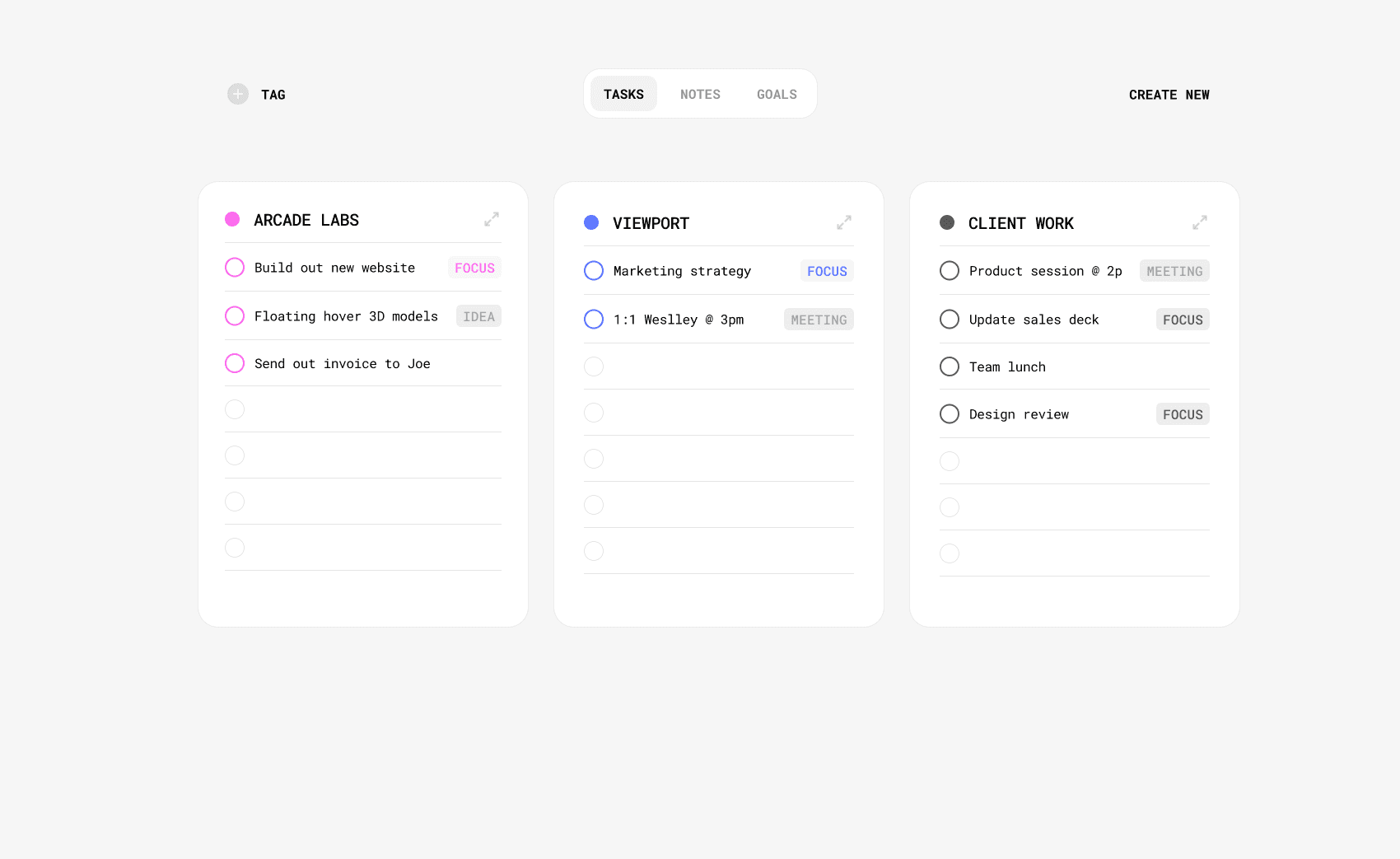
Here's a few screenshots of rough early prototypes I designed and tested.


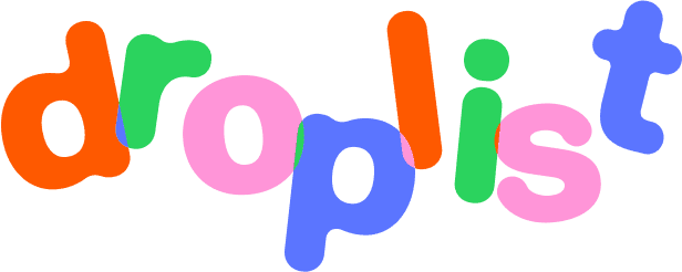
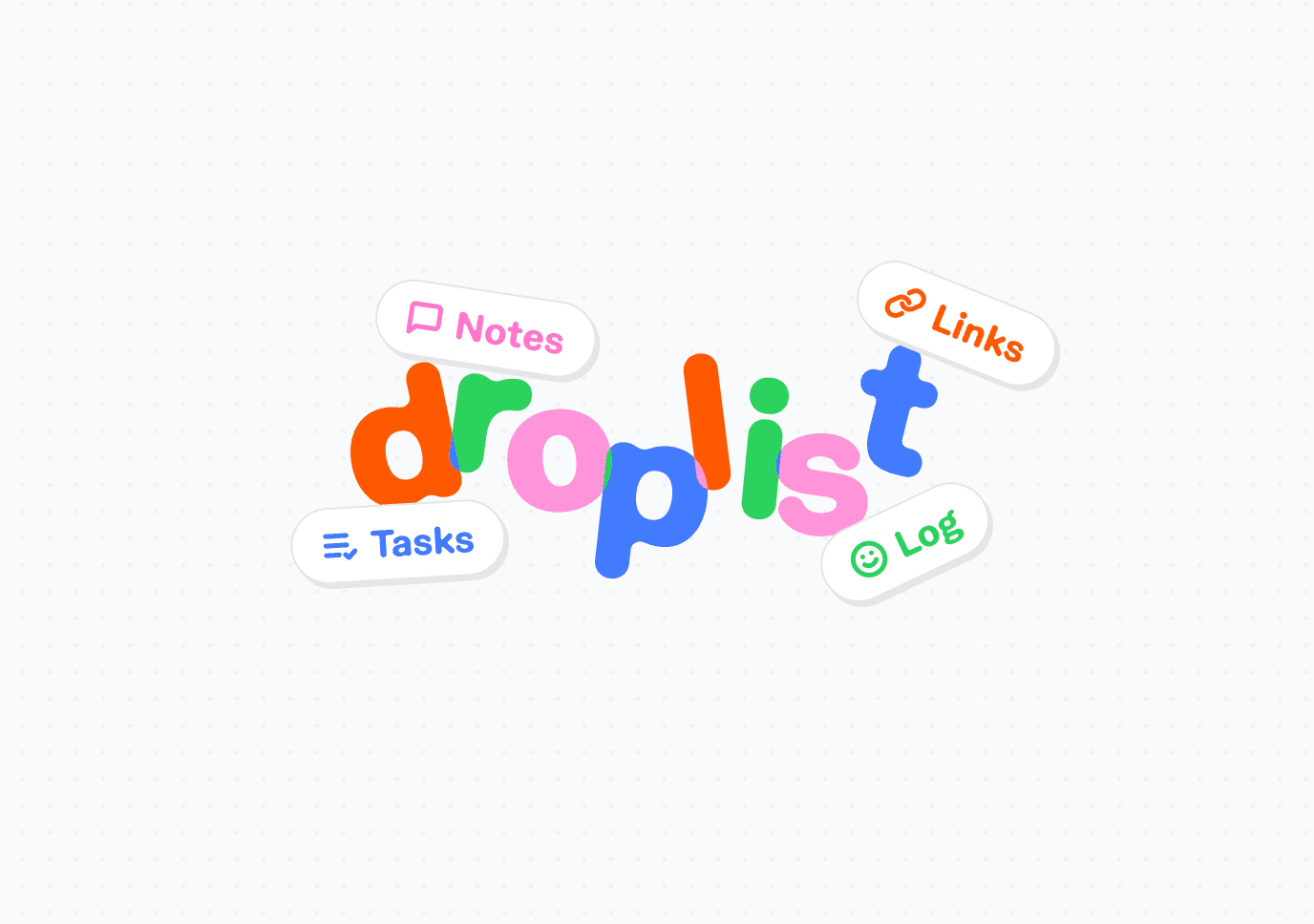
After the product got more developed and I landed on a name, I wanted to find a balance for a brand that felt lightweight but whimsical
After all, it's just a simple notes and daily task app, these tools should be fun and spark some joy.
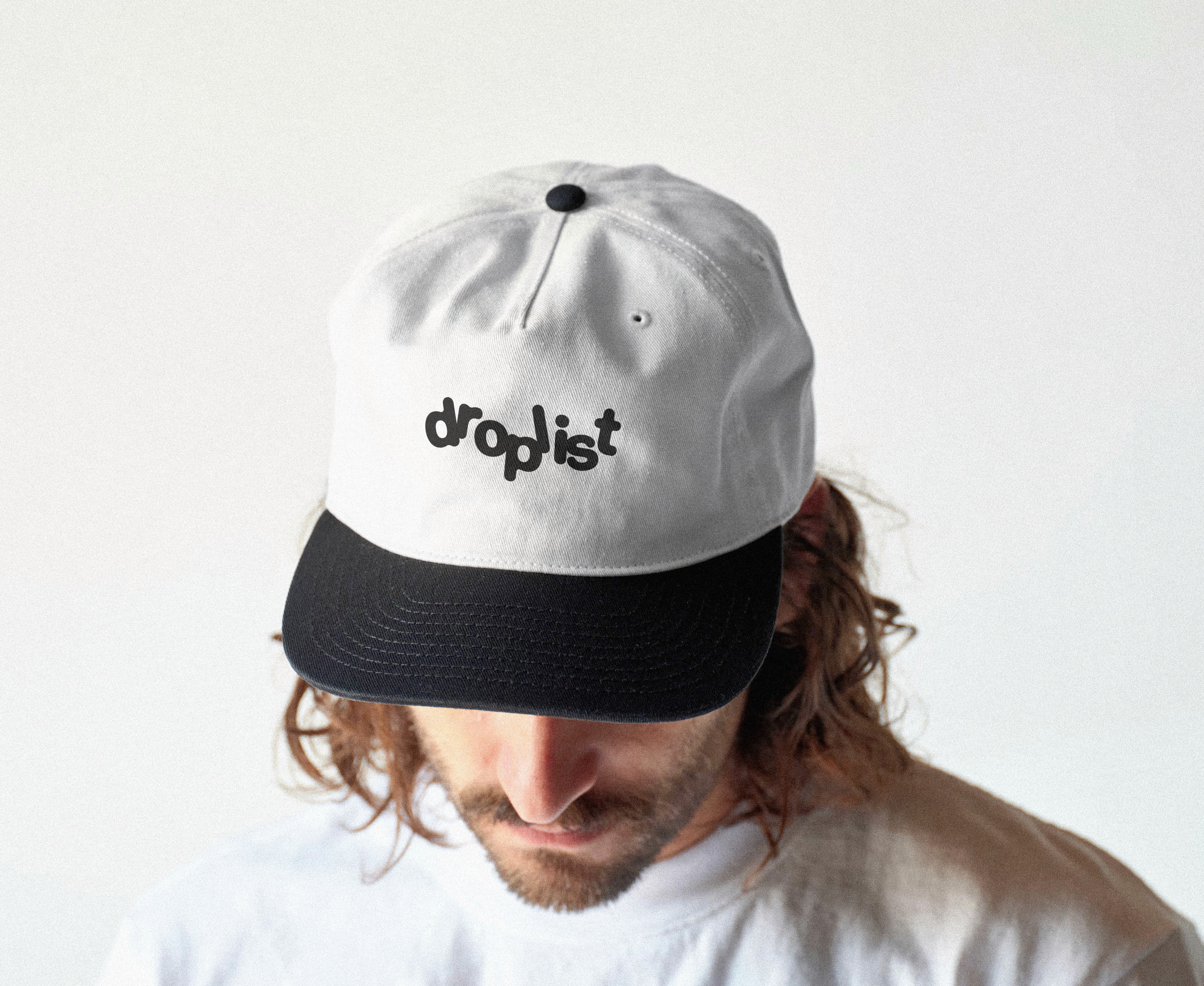
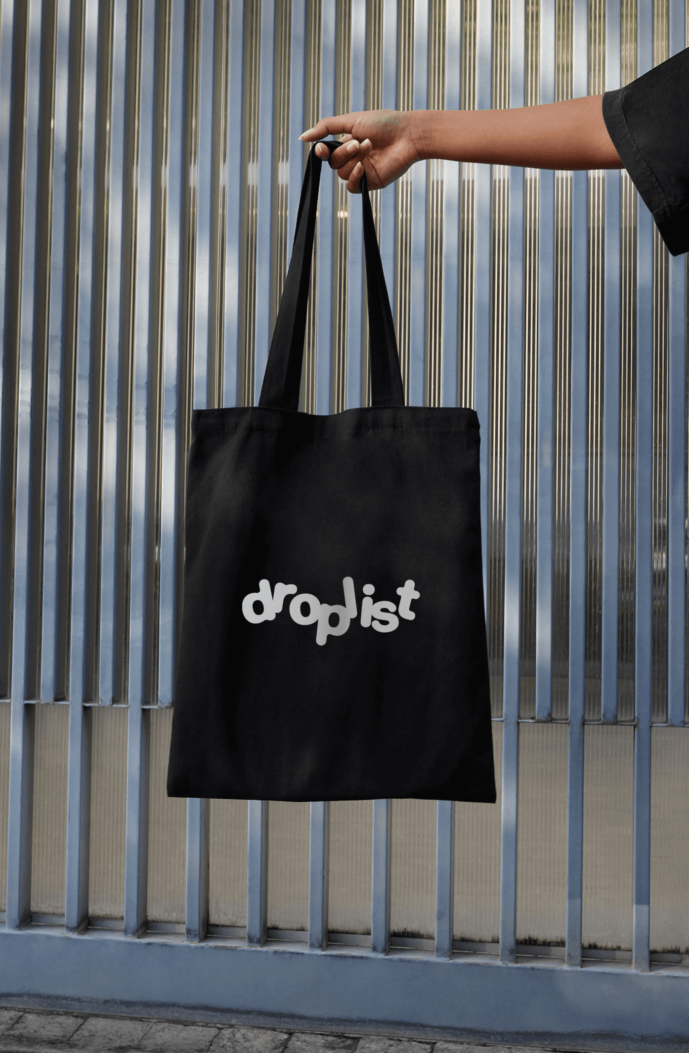
Cause why shouldn't a lil productivity app have cool swag? That's always the true test, would you rock this logo not knowing what it's for?


Thanks for reading along! I have a lot more in store for this lil app, stick around if you want to see how it grows :)
No AI was used in this story, and it probably shows! (for better or worse) Public beta and native Apple apps coming soon!